Daily news, dev blogs, and stories from Game Developer straight to your inbox
Sponsored By
Featured Blog | This community-written post highlights the best of what the game industry has to offer. Read more like it on the Game Developer Blogs.
Shades of progress — Revamping our diorama colors in Dragon Slayers
In this episode of Checkmate Chronicles, we'll delve into the visual progression of the Dragon Slayers levels.
2 Min Read
In the quest to evolve and perfect the visual storytelling of Chessarama, our Art Team has continuously faced challenges and puzzles off the board.
The primary question was: how do we keep players visually engaged, level after level?
In this episode of Checkmate Chronicles, we'll delve into the visual progression of the Dragon Slayers levels.
The Chessarama canvas: a unique approach for Dragon Slayers
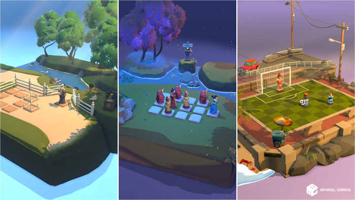
In Chessarama's Campaign Mode, players have been treated to a diverse visual landscape that shifts with time: from the morning serenity of Farm Life to the twilight ambiance of Lady Ronin, and the sunset energy of Street Soccer.
Each game has employed a day-to-night transition to mark the player’s progression.
However, for Dragon Slayers, we took a different path. Instead of using times of the day as milestones, we leaned into the increasing challenges and the escalating path of destruction caused by the dragon.
The initial levels present a more "peaceful" atmosphere, contrasting sharply with the later stages overwhelmed with a "dark" mood, echoing the fire and devastation brought upon the kingdom by the dragon.
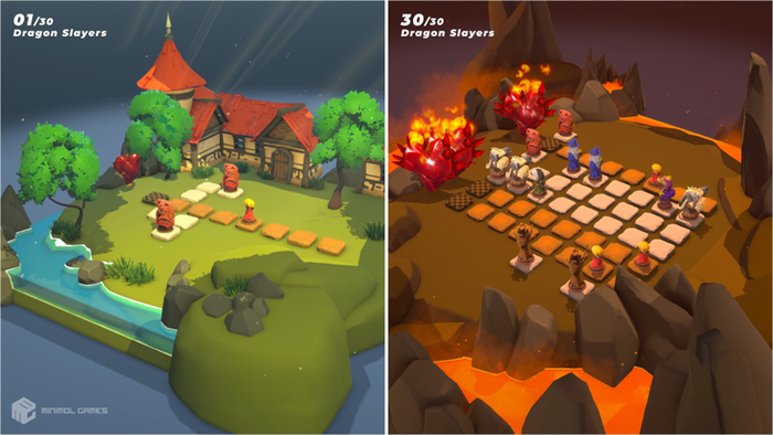
This shift wasn't just about aesthetics but was a conscious attempt to align the visual narrative with the game's rising difficulty and evolving storyline.
Initial choices and revisions
Our beginning was uncomplicated but lacked movement - a single brown shade was used for the entire Dragon Slayers background:
This palette provided a harmonious look, yet missed the dynamism we sought.
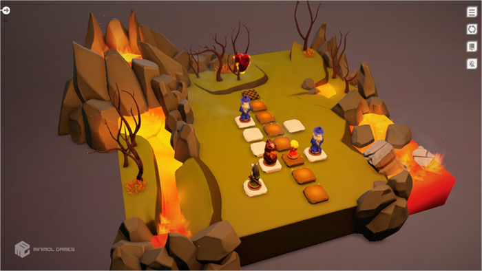
The aim was to transition from lighter to darker tones. Thus, starting with a serene blue seemed like a logical step. However, it became apparent that it resembled our "Lady Ronin" theme too closely, prompting us to change direction:
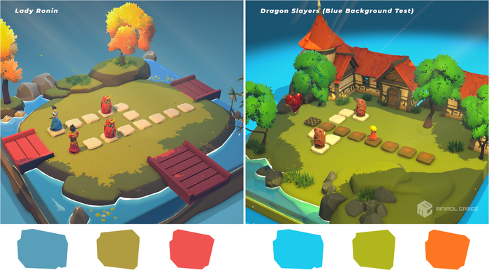
Diving deeper into color choices
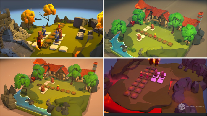
Committed to finding the ideal palette, we ventured beyond primary colors, diving deep into various tones, illuminations, temperatures, and saturations. We ran different tests that included trying out different lighting scenarios, exterior floor color, and post-processing profiles.
Here are some ideas that we explored:
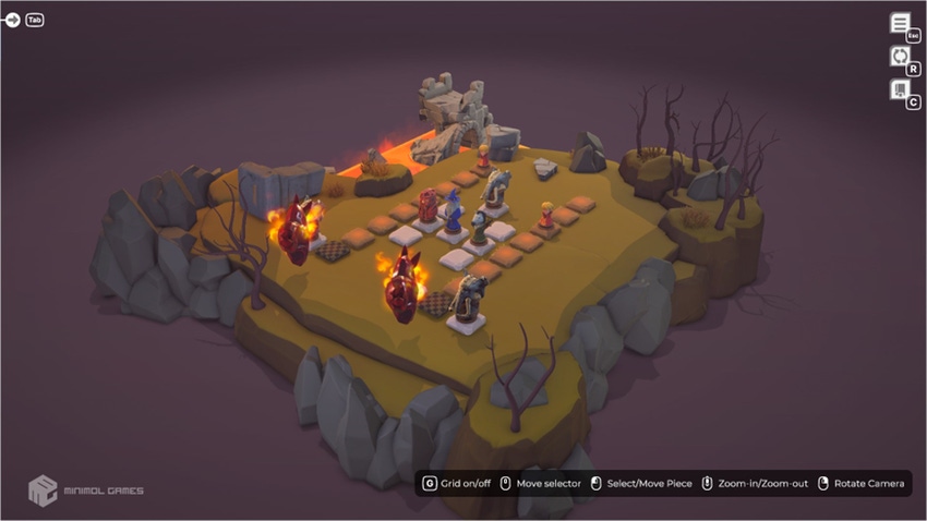
Final palette: a descent into chaos
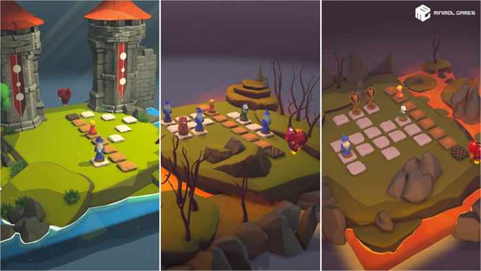
We settled on a visual sequence involving three color shifts.
It begins with a subdued purple-blue that focuses attention on the board, transitioning to an orange-filled light as lava engulfs the diorama.
This shift isn't solely about aesthetics; it carries symbolism, reflecting the gameplay's increasing stakes.
The endeavor to redesign the Dragon Slayers background was a genuine challenge, but the end result was undoubtedly worth it:
Through meticulous design, color theory, and multiple iterations, we've sculpted a landscape that tells the Dragon Slayers' tale.
We hope that as players strategize their moves, they're equally immersed in the dynamically evolving world we've crafted!
We’re loving to share our artist process with you! Stay tuned for more insights behind Chessarama. 💙
And don't forget to add Chessarama to your Wishlist!
See you soon! ♟️
About the Author(s)
You May Also Like
Latest News
Trending


Featured Blogs


