Game Developer is part of the Informa Tech Division of Informa PLC
Informa PLC
|
ABOUT US
|
INVESTOR RELATIONS
|
TALENT
This site is operated by a business or businesses owned by Informa PLC and all copyright resides with them. Informa PLC's registered office is 5 Howick Place, London SW1P 1WG. Registered in England and Wales. Number 8860726.
Game Market Research
GDC Vault
GDC
Advertise With Game Developer
Stay Updated
Stay Updated
News
Trending
Related Topics
Game Industry Layoffs
GDC 2024 Coverage
Generative AI
Investments & Aquisitions
Unionization
Top Stories
Business
Game Design
Marketing
Programming
More
Related Topics
Interviews
Q&A's
Deep Dives
Postmortems
Culture
Business
Marketing
Design
Programming
Production
Art
Audio
Recent in
More
Read More: Business
Key art for Atlus' Persona 3 Reload.
Business
Kazuma Kaneko, longtime Atlus artist, departs after 35-year run
Kazuma Kaneko, longtime Atlus artist, departs after 35-year run
by
Justin Carter
Apr 23, 2024
2 Min Read
Screenshot of various games available on the Apple Arcade.
Business
Apple reaffirms faith in Arcade, says Vision Pro included in platform plans
Apple reaffirms faith in Arcade, says Vision Pro included in platform plans
by
Justin Carter
Apr 23, 2024
2 Min Read
Blogs
Related Topics
All Blogs
Featured Blogs
Blogging Guidelines
Blog Now
See All
Jobs
Related Topics
Game Artist
Game Animation
Video Game Designer
Game Programmer
Gameplay Engineer
Education
More Jobs
See All
Sponsored By
Home
Blogs
Blogs
thumbnail
Production
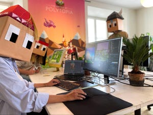
Developing Disaster Golf
Developing Disaster Golf
by
Douglas Guzman,
Kyle Grenier
Apr 19, 2024
4 Min Read
thumbnail
Design
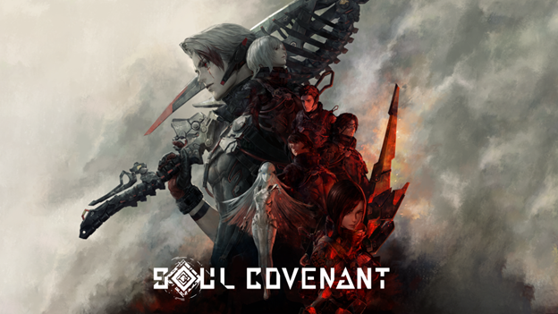
Charting the Journey of SOUL COVENANT: A New Frontier in VR JRPGs
Charting the Journey of SOUL COVENANT: A New Frontier in VR JRPGs
by
Masaru Ohnogi
Apr 15, 2024
4 Min Read
Business
Taking first-party data to the next level with machine learning
Taking first-party data to the next level with machine learning
Apr 15, 2024
|
5 Min Read
by
Greg Castro
Business
Establishing partnerships with major IPs: benefits and nuances for mobile game developers
Establishing partnerships with major IPs: benefits and nuances for mobile game developers
Apr 12, 2024
|
3 Min Read
by
Liza Savenkova
Design
Pre-Production and Brainstorming Optimization
Pre-Production and Brainstorming Optimization
Apr 12, 2024
|
5 Min Read
by
Anjali Tyagi
Production
How to make an Indie Game for 100€
How to make an Indie Game for 100€
Mar 28, 2024
|
3 Min Read
by
Luis Augsburg
Design
What Walkabout Mini Golf’s Players Tell Us They Value in VR Right Now
What Walkabout Mini Golf’s Players Tell Us They Value in VR Right Now
Mar 25, 2024
|
7 Min Read
by
David Wyatt
Business
We Need To Talk About Gaming’s User Acquisition Problem
We Need To Talk About Gaming’s User Acquisition Problem
Mar 25, 2024
|
3 Min Read
by
Leo Li
Design
Level Design Compare: FPS vs TPS Games
Level Design Compare: FPS vs TPS Games
Mar 25, 2024
|
8 Min Read
by
Liu Xinyan
Design
Pocomon
Pocomon
Mar 25, 2024
|
7 Min Read
by
Nikhil Murthy
Design
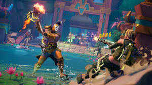
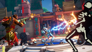
Hunting for Narrative gold: Designing the treasure hunting world of HAWKED
Hunting for Narrative gold: Designing the treasure hunting world of HAWKED
Mar 13, 2024
|
8 Min Read
by
Vladimir Semykin
Marketing
Game Accessibility at GDC 2024
Game Accessibility at GDC 2024
Mar 13, 2024
|
4 Min Read
by
Ian Hamilton
Production
How to save $10 million on your next game
How to save $10 million on your next game
Mar 7, 2024
|
8 Min Read
by
Matthew Zoern
Design
A Game Urbanism Bibliography
A Game Urbanism Bibliography
Mar 1, 2024
|
3 Min Read
by
Konstantinos Dimopoulos
Art
A comic-book style action shooter: creating the visual look of HAWKED
A comic-book style action shooter: creating the visual look of HAWKED
Feb 29, 2024
|
12 Min Read
by
Margarita Borzykh
Production
Dear Tester, this is how you can help us be innovative
Blog | Dear Tester, this is how you can help us be innovative
Feb 26, 2024
|
10 Min Read
by
Christy Dena
Art
How to create comic-book style VFX for games, like in HAWKED
How to create comic-book style VFX for games, like in HAWKED
Feb 16, 2024
|
5 Min Read
by
Vladimir Semykin
Design
The Adventures of Micah: The Origin
The Adventures of Micah: The Origin
Feb 16, 2024
|
8 Min Read
by
Micah Barga
Design
How chess inspires winning moves for strategic game design
How chess inspires winning moves for strategic game design
Feb 14, 2024
|
4 Min Read
by
Christian Lövstedt
Extended Reality
5 Reasons Why Apple Vision Pro Is Significant for XR Gaming
5 Reasons Why Apple Vision Pro Is Significant for XR Gaming
Feb 14, 2024
|
9 Min Read
by
Patrick O’Luanaigh
Audio
Crafting Immersive Audio Experiences for Interactive VR Narratives
Crafting Immersive Audio Experiences for Interactive VR Narratives
Feb 12, 2024
|
3 Min Read
by
Larry Yu-cheng Chang
Game Platforms
Building the Arcade Cabinet, Part 1: Planning
Building the Arcade Cabinet, Part 1: Planning
Feb 12, 2024
|
5 Min Read
by
Nathan Fouts
Business
Forget AI, online safety is the biggest risk facing gaming companies
Forget AI, online safety is the biggest risk facing gaming companies
Feb 9, 2024
|
3 Min Read
by
John Brunning
Design
How HAWKED Evolves Extraction Shooters with Treasure Hunts and Puzzles
How HAWKED Evolves Extraction Shooters with Treasure Hunts and Puzzles
Feb 8, 2024
|
12 Min Read
by
Vladimir Semykin
Design
Fun, Unrestricted: Embracing Accessibility In Gaming
Fun, Unrestricted: Embracing Accessibility In Gaming
Feb 5, 2024
|
5 Min Read
by
Adil Ummer
Production
Transitioning from PC-only development to multiple platforms
Transitioning from PC-only development to multiple platforms
Feb 1, 2024
|
5 Min Read
by
Grigoris Nikiforakis
Design
VAUDEVILLE PRE-MORTEM
VAUDEVILLE PRE-MORTEM
Jan 31, 2024
|
6 Min Read
by
Simone Odoardi
Design
Robocop: Rogue City and the curse of the shooter/rpg genre smash.
Robocop: Rogue City and the curse of the shooter/rpg genre smash.
Jan 30, 2024
|
7 Min Read
by
Jon Place
Business
How to accelerate the gaming industry in 2024
How to accelerate the gaming industry in 2024
Jan 30, 2024
|
2 Min Read
by
Rethabile Kau
Design
Level Design Process #01: Cube to Temple
Level Design Process #01: Cube to Temple
Jan 29, 2024
|
22 Min Read
by
Amin Montazeri
Production
Navigating the Unknown: Developing a Mixed Reality Game from Ground Up vs. a Console Game
Navigating the Unknown: Developing a Mixed Reality Game from Ground Up vs. a Console Game
Jan 25, 2024
|
9 Min Read
by
Fabrice Jouvenot
Design
Difficulty curves: how to get the right balance
Difficulty curves: how to get the right balance
Jan 24, 2024
|
5 Min Read
by
Guy Agiv
Marketing
The future of gaming is device-agnostic; it’s time for marketers to adapt
The future of gaming is device-agnostic; it’s time for marketers to adapt
Jan 19, 2024
|
3 Min Read
by
Ender Ozcan
Business
Forecasting work in video game development
Forecasting work in video game development
Jan 18, 2024
|
10 Min Read
by
Peter Willington
Design
The Realities of Narrative
The Realities of Narrative
Jan 18, 2024
|
3 Min Read
by
Juliana Hand
Previous
1
2
3
4
5
…
357
Next
Latest News
Key art for Atlus' Persona 3 Reload.
Business
Kazuma Kaneko, longtime Atlus artist, departs after 35-year run
Kazuma Kaneko, longtime Atlus artist, departs after 35-year run
by
Justin Carter
Apr 23, 2024
2 Min Read
Screenshot of various games available on the Apple Arcade.
Business
Apple reaffirms faith in Arcade, says Vision Pro included in platform plans
Apple reaffirms faith in Arcade, says Vision Pro included in platform plans
by
Justin Carter
Apr 23, 2024
2 Min Read
Get daily news, dev blogs, and stories from Game Developer straight to your inbox
Subscribe to Game Developer Newsletters to stay caught up with the latest news, design insights, marketing tips, and more
Stay Updated
Trending
thumbnail
Design
Deep Dive: Expanding accessibility for As Dusk Falls’ PlayStation port
Deep Dive: Expanding accessibility for As Dusk Falls’ PlayStation port
by
Aoife Gleeson,
May Wong
Apr 23, 2024
12 Min Read
A selection of retro Infogrames logos
Business
Atari relaunches Infogrames, immediately buys Totally Reliable Delivery Service
Atari relaunches Infogrames, immediately buys Totally Reliable Delivery Service
by
Chris Kerr
Apr 23, 2024
2 Min Read
The Meta Horizon OS logo
Extended Reality
Meta expanding mixed reality ecosystem under Meta Horizon OS banner
Meta expanding mixed reality ecosystem under Meta Horizon OS banner
by
Chris Kerr
Apr 23, 2024
3 Min Read
Featured Blogs
Design
The Six Stages of Player Rationality
The Six Stages of Player Rationality
Apr 19, 2024
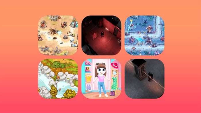
a collection of colorful screenshots showing creative tools
Design
Solo-Devs and risk-takers (an artistic exploration of experimental tools)
Solo-Devs and risk-takers (an artistic exploration of experimental tools)
Apr 19, 2024
Design
Postmortem: The Sirena Expedition
Postmortem: The Sirena Expedition
Apr 18, 2024
Daily news, dev blogs, and stories from Game Developer straight to your inbox
Stay Updated


.png?width=300&auto=webp&quality=80&disable=upscale)